National Gallery

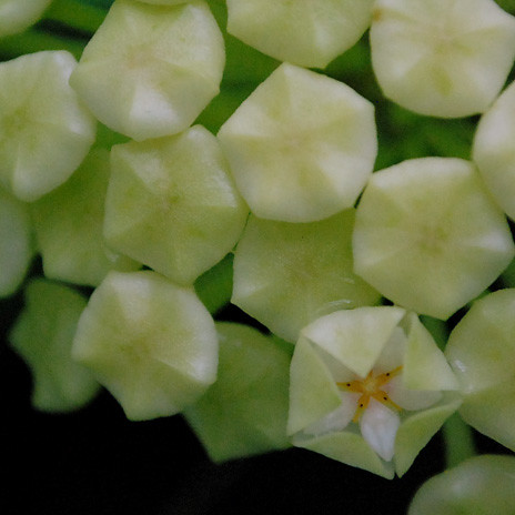
Botanical gardens


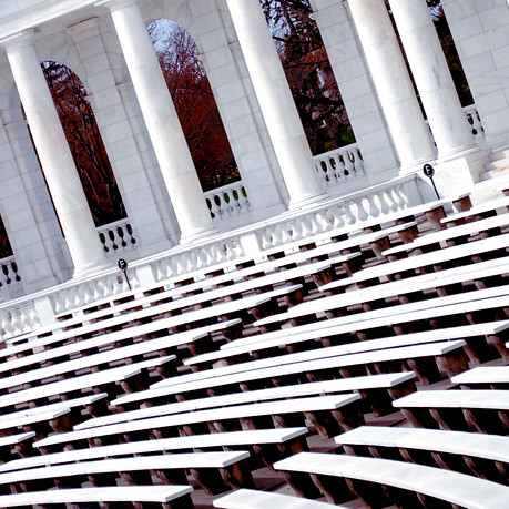
Arlington and the monuments


Old post office tower


Hmm. Well. This was fun and interesting.
Squares. Sure.
Maybe I will give myself more assignments. this was fun :).
I plan on treating the pictures differently for my family... but squares were really hard. Partially because I am taking photos in a rectangle and paying attention as much as I can to composition in a rectangle. Turning it to a square is really different. What do you keep? What do you omit? How do you create an obvious balance or unbalance in something that is by nature balanced, uniform, and symmetrical in so many ways. How do you find an asymmetry that keeps things interesting? I think maybe my next challenge will be to center my subject intentionally to make things symmetrical and almost uncomfortable. I noticed that pretty much all of my composition lends itself to a focal point in one lower hand corner or the other. hmm. why not the upper corner? I don't know.
Keep looking. :)
B

2 comments:
Bekah Kitterman is my hero. If you're ever at a loss for an assignment, come see me. I can be pushy. :)
hhmmmm squares...i like. the part about what you have to sacrifice or lose to fit/be square...suppose that applies to people too ;-)
Post a Comment